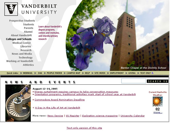
2003 – Homepage
2003: The next version of the homepage was an evolution more than a revolution. Focus groups liked the look of the site so much that we decided to stick with the basic graphic presentation. The biggest changes were to the structure and content of the 2nd level pages. In previous 2nd levels, the content was spread out between two-to-four pages per category; in this redesign we consolidated the information to one page per category with sub-category headings on each page. On the homepage, we added the new wordmark, added new categories (About Vanderbilt and Technology), clarified other categories (Research became its own category, Libraries linked to the Libraries homepage, and Working at Vanderbilt contained information for current faculty and staff as well as prospective faculty and staff). We updated the horizontal navigation to include the most searched for pages (such as Webmail and Prometheus), and we changed the way News and Events are presented.
