Author
Crisis Communication – the 2010 Nashville Flood website
Jun. 5, 2010—The flood website has been a continually changing resource for the Vanderbilt community. In it’s earliest form, it was a very plain single HTML page that we built on Sunday, May 2. (18,600 unique pageviews that day). There were only a few of us who had dependable internet and phones that day; for those of...
Vanderbilt WordPress Theme Released
Jun. 4, 2010—The Vanderbilt WordPress Theme has a control panel that will allow you set many options. I’d suggest installing it – putting in a few pages and posts so you can have some content pre-populated – and then turn on and off options in the control pane that is accessible via the VANDERBILT BRAND menu at...
People Finder redesigned
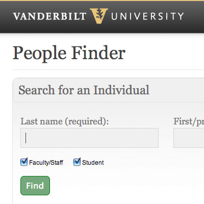
Jun. 2, 2010—We collaborated with MIS (Management Information Systems) on this minimalistic redesign. At this time, it wasn’t possible to update any of the functionality of People Finder, but we could apply a new look (reskinning is the word we used). All of the data display areas (search results, individual record display, departmental display, etc.) use the...
Get to know the GRID … 24 columns that the VU site is built on
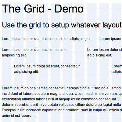
May. 28, 2010—The Vanderbilt website backbone is a 24-column grid that is based on Blueprint. Our grid system is a condensed version of the blueprint system (for instance -we did NOT include the push and pull selectors.) The grid is 950px wide, with 24 columns spanning 30px, and a 10px margin between columns. Using a grid system...
Simple Template Files Released
May. 19, 2010—These template files are STATIC html pages. The easiest way to get them is to right click on the pages and view source, and save that as an html file on your machine. You can customize it however you want. Simple second level page template Full featured second level page template (with image slider, flickr...
University Calendar redesigned
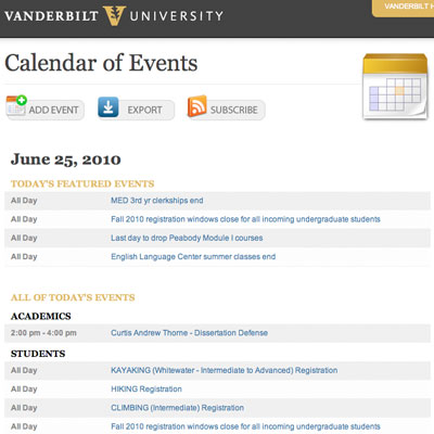
May. 18, 2010—The University Calendar is all up-to-date (get it?) with a look that matches the just-launched homepage. We changed the homepage to show all of today’s events (previously, it just showed highlighted events, with an option to view all – confusing). We didn’t change the functionality or the back end of the Calendar – the data...
Logins page
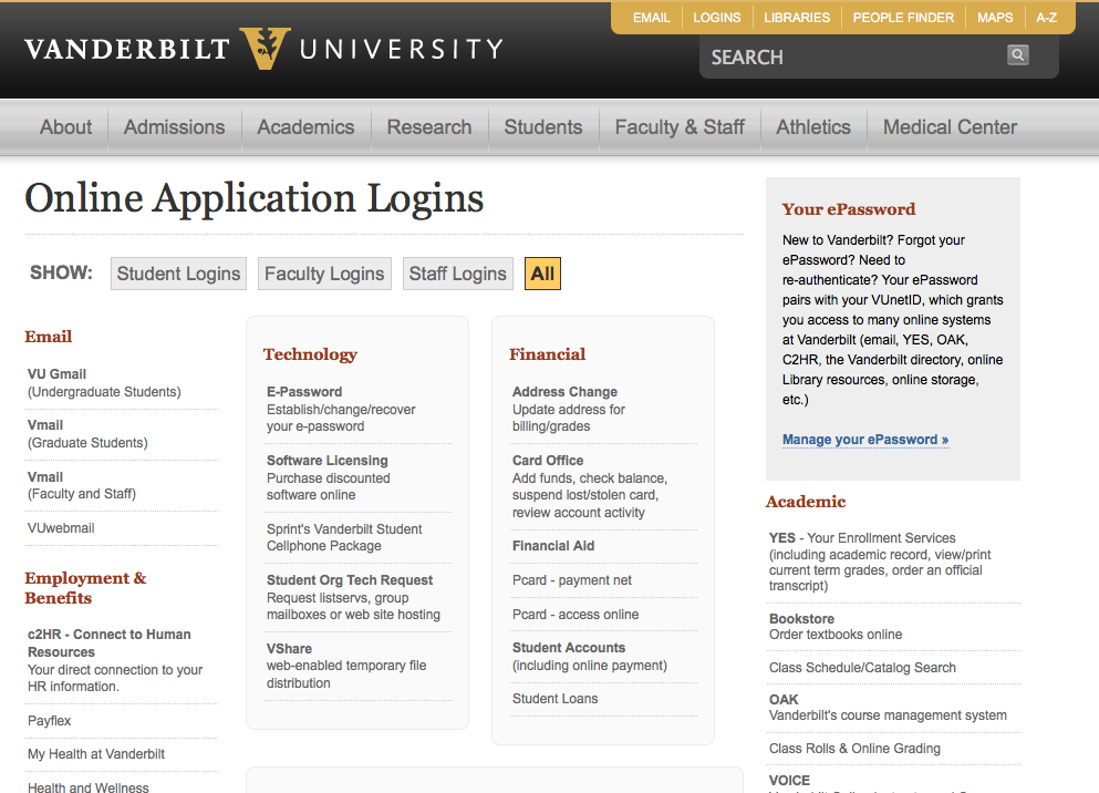
May. 18, 2010—As part of the new website – we expanded upon an old student web applications page that listed the top login pages students used. We merged that into a new logins page which houses the most commonly used logins for students, faculty and staff. The mini-nav-bar at the top allows users to click on an...
Vanderbilt Brand Bar
May. 18, 2010—The Vanderbilt Brand Bar gives departments a quick and easy way to incorporate the Vanderbilt look into their site. With just one simple line of code, you can update your site to include the Vanderbilt wordmark – used correctly (no need to worry if you’re meeting the Graphics Standards Guidelines) – and the required link...
New Vanderbilt website launched
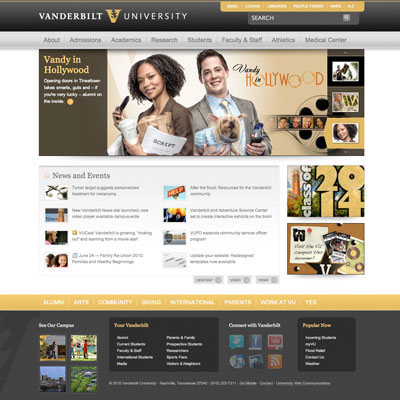
May. 17, 2010—Vanderbilt launched a new homepage on the evening of May 17, focusing on making key resources easier to find while continuing to showcase the institution’s dynamic academic, research, patient care and campus life offerings. Take a closer look at the changes » “The Web and our usage of it have evolved dramatically since we last...
Disciplines and Majors database and site launched
May. 17, 2010—A frequent request of prospective students and many across the campus was to have a centralized source of all disciplines and majors available for students at Vanderbilt. Rather than start from scratch, we approached the Vanderbilt Institutional Research Group (VIRG) to see if we could collaborate with them on creating such a tool. VIRG already...
Provost website migrated
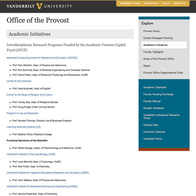
May. 17, 2010—The Provost site was previously maintained manually. We moved all the content into WordPress, applied the Vanderbilt WordPress theme, and went live.
It’s alive… homepage launched!
May. 17, 2010—We are happy to announce the new Vanderbilt homepage launched on the evening of May 17. Many thanks to the readers of the redesign blog who provided invaluable input throughout this process. Take it for a spin, being sure to check out the new second levels, tools, fat footer and megadropdowns, and let us know what...


