‘news’

Web Communications Teams

Nov. 2, 2015—We’re excited to share with you some changes that are occurring within Web Communications. We have all seen our group come together into a team over the past two years (since the web merger); the knowledge sharing and synergies of having all of the web-focused staff together have been made evident time and again. We...

Read more


Admissions, reimagined and simplified

Jan. 27, 2012—Simplify. Simplify. Simplify. That was the overarching theme of many of our discussions with the Office of Undergraduate Admissions when imagining a new Web presence. Let’s step back and make things easier for the user. Focus on the key MESSAGES that UoA wants to get out there about Vanderbilt. What are the key ACTIONS we...

Read more


MyVU and Vanderbilt View now powered by WordPress

May. 5, 2011—Earlier last month myVU, the news source for Vanderbilt faculty and staff, and Vanderbilt View, the monthly magazine, merged with the Vanderbilt News web presence. This allows us to greatly simplify how we communicate news at Vanderbilt. Prior to the merge, many news stories would be posted twice, verbatim.  Once on the Vanderbilt news website...

Read more


myVU gets brand bar, php templates and more!

Jul. 22, 2010—This was another fairly quick template swap. The old myVU templates were xsl, we moved them over to php, updated some stylesheets, added the VU brandbar, added a new video player that displays videos from the VUCast playlist and launched.  We’ll be cleaning up the site over the coming weeks – but our goal was...

Read more


New Vanderbilt News site launched; new video player available campus-wide

Jun. 21, 2010—Keeping up with the latest news from Vanderbilt is now easier than ever. The redesigned Vanderbilt News website launched June 14, featuring a dramatic new look, a robust new back end and features that are available for all Vanderbilt departments. New features and technology available Video is a focal point of the new site, showcasing...

Read more


Get to know the GRID … 24 columns that the VU site is built on

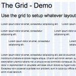
May. 28, 2010—The Vanderbilt website backbone is a 24-column grid that is based on Blueprint. Our grid system is a condensed version of the blueprint system (for instance -we did NOT include the push and pull selectors.) The grid is 950px wide, with 24 columns spanning 30px, and a 10px margin between columns. Using a grid system...
Read more


Progress of the migration of news site data

Apr. 30, 2010—We’ve been chugging along on the Vanderbilt News site migration over the past several weeks. Once we finally made the decision that we would definitely be going with WordPress as the backend, we could finally start working out the process for migrating approximately 4,000 pages from the old CMS. It was a 4 step process...

Read more


Email – VUToday

Jan. 18, 2010—

Read more


Email – myVUpreview

Sep. 4, 2009—myVUpreview is an email newsletter that goes out to all Vanderbilt faculty and staff each Monday and Thursday. The email is managed by the Vanderbilt News Service. They wanted to move from a text-only email to an html email – and they needed to be able to quickly and easily build these emails without writing...

Read more