Typography Guidelines

The most important thing to consider when looking at the fonts and typography on a website is legibility. In addition to being aesthetically pleasing, your typography should be easy to read and understandable from a user perspective. Vanderbilt’s templates have been built with this in mind, and are designed to convey information to your users in a way that is in keeping with current web standards. Below is a breakdown of why certain choices are made, and the importance of how you structure your text.
Hierarchy
Think of the content on your website in the way you might think of an outline when preparing to write a paper in school. The headings you choose should reflect the hierarchy of your information. For example, the title of your page will be in your largest, boldest font. Headings will follow in a slightly smaller font, followed by subheadings. You can then organize your paragraphs under the appropriate heading.
Some sections may have slightly different headings or hierarchies; for example, a sidebar or attention box may look slightly different than your standard heading in order to draw the reader’s eye to it.
Examples:
Title
Head
Subhead
Paragraph text
Consistency and simplicity
You should use no more than 2-3 fonts per page; ideally no more than two. In addition, the fonts you use should complement each other. There are two basic types of fonts to choose from
Serif fonts
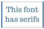
 Serif fonts are typically used in printed works, because they are easier to read. They have tail lines at the edge of letters and numbers. Some examples of serif fonts are Times New Roman and Georgia
On the web, serif fonts can be useful as headings, but can become overwhelming when used in large paragraph blocks
Sans -serif fonts
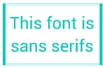
 Sans-serif fonts are often used on the web, because they are clean and simple. They work better in this medium because of the resolution of the monitors they are displayed upon. Some examples of serif fonts are Arial and Helvetica.
On the web, sans-serif fonts are best served as paragraph text, though certain sans-serifs can make great header text
Font size
The sizes of the fonts you use should remain consistent. On Vanderbilt sites, this is accomplished through the use of site stylesheets which standardize headings and paragraph fonts. Any modifications are best made at a site level, as opposed to on individual pages.
Line spacing and kerning
It is important to use proper line spacing for your typography. Lines that are too close together will make it difficult for your user to read and likely result in them navigating away from your content. It is better to have a user scroll a bit than lose them entirely.

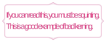
On that note, it is important to make sure that the kerning of your font is legible. Kerning is the spacing between letters or characters, and while it is possible to change this on the web, Vanderbilt’s current styles keep things legible. In addition, most browsers have built-in kerning settings that will always optimize a site’s font to make it legible

Color palettes
In general, color can be a tricky topic on the web. It is best to stick to complimentary colors that are easy on the eye. Garish fonts and colors can combine to create an unpleasant experience for the user, which is not what you want when someone visits your site.